MyAbility is a mobile app designed to simplify how students with mobility disabilities access healthcare, resources, and community support. Information for this population is often scattered across websites, social media, and word of mouth — MyAbility brings it all into one clear, accessible platform.
Students are left to figure it out alone.
There is no single, reliable place for students with mobility disabilities to find the providers, resources, and community support they need on or near campus. The search is exhausting before the help even begins.
- Information is scattered across multiple sites and platforms
- Finding relevant healthcare providers is difficult and time-consuming
- Students feel overwhelmed by the search process
- Word of mouth and social media are the primary — and unreliable — sources
UX Designer
I led the end-to-end design process: research, wireframing, prototyping, and usability testing.
Listening before designing.
Before sketching a single screen, I conducted primary research to understand the real challenges students face. The findings made the problem concrete — and the direction clear.
Participants consistently relied on social media and word of mouth to find resources — a fragile system that puts the burden on the student. The research pointed clearly toward a centralized, well-organized platform as the solution.
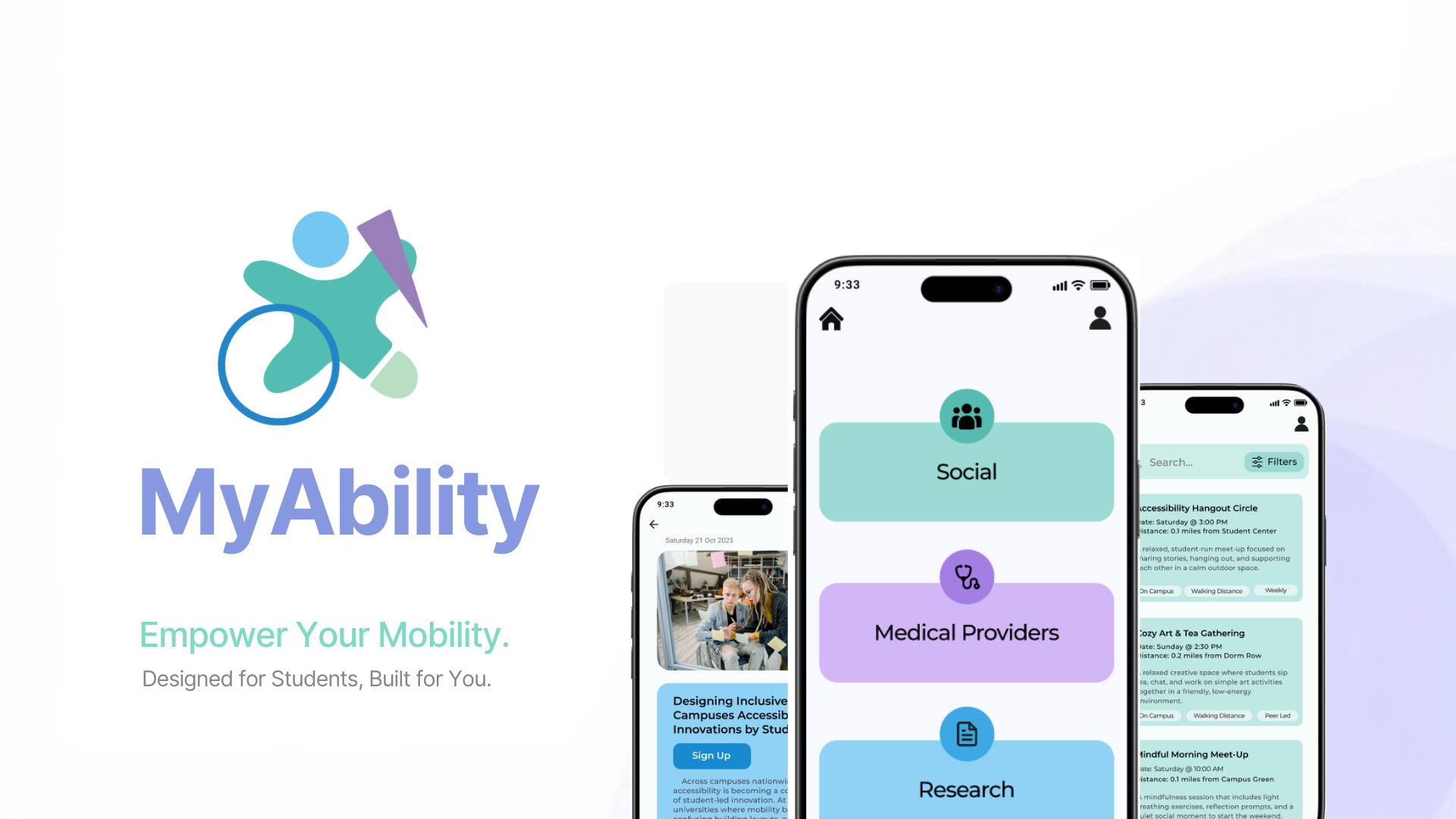
One place for everything you need.
MyAbility reduces friction at every step — from discovery to action. Three core features anchor the experience.
Centralized platform
One place for resources, research, and providers — no more tab-switching or dead ends.
Filtering system
Helps users quickly surface relevant options without having to scroll through everything.
Accessible UI
Clean layout, high contrast, clear hierarchy — designed to be easy to navigate from the start.
From sketches to screens.
The design evolved through several rounds of iteration. Low-fidelity wireframes established structure and flow; high-fidelity prototypes refined the visual language and interaction details. Each round incorporated user feedback.
Wireframes
Low-fi
High-fi
Iterated based on user feedback to improve clarity and navigation.
Tested. Validated. Iterated.
Usability testing with real users confirmed the core design decisions were effective — and pointed to refinements that made the experience even clearer.
Silver Award — AEJMC Festival of Visual & Interactive Media
2026 · Interactive Design category
What I learned.
"This project strengthened my ability to design for accessibility and reinforced the importance of clear, user-informed decisions. Iteration based on real feedback made the biggest impact."
[ADD FINAL COPY — add any additional reflection on what you'd do differently or what you took away from the AEJMC submission process.]